Jusme Juice Product Design
Jusme Product Design Project
Project Brief
The packaging design project is an integral component of the City and Guilds graphic design course. The assignment involved a thorough analysis of existing fruit juice brands to understand their design strategies and conceptual frameworks. This research phase was pivotal in developing a brand name that would resonate with consumers and fulfill the project’s requirements.
The brand was christened ‘OPAC,’ an acronym derived from the four flavors offered: Orange, Pear, Apple, and Cranberry. ‘Jusme,’ the product name, emerged from a creative play on the words ‘juice’ and ‘me,’ encapsulating a personal touch to the beverage experience. The color scheme for the packaging was directly inspired by the vibrant hues of the fruits, coupled with elements that evoke a sense of refreshment, to craft a visually appealing and marketable product design.
Assignment
Product design for a fruit juice, look for a name, look, and style—fresh and refreshing, colourful and fun.
Objective
Research other products that would compete with our brief and find a name for the product, design packaging and style the product, and produce mockups of packaging and advertising.
Project Includes
- Package Design Ideations
- Naming Directions
- Final Design
- Design Presentation
Date: 2012
Client: Kensington & Chelsea Collage — further information
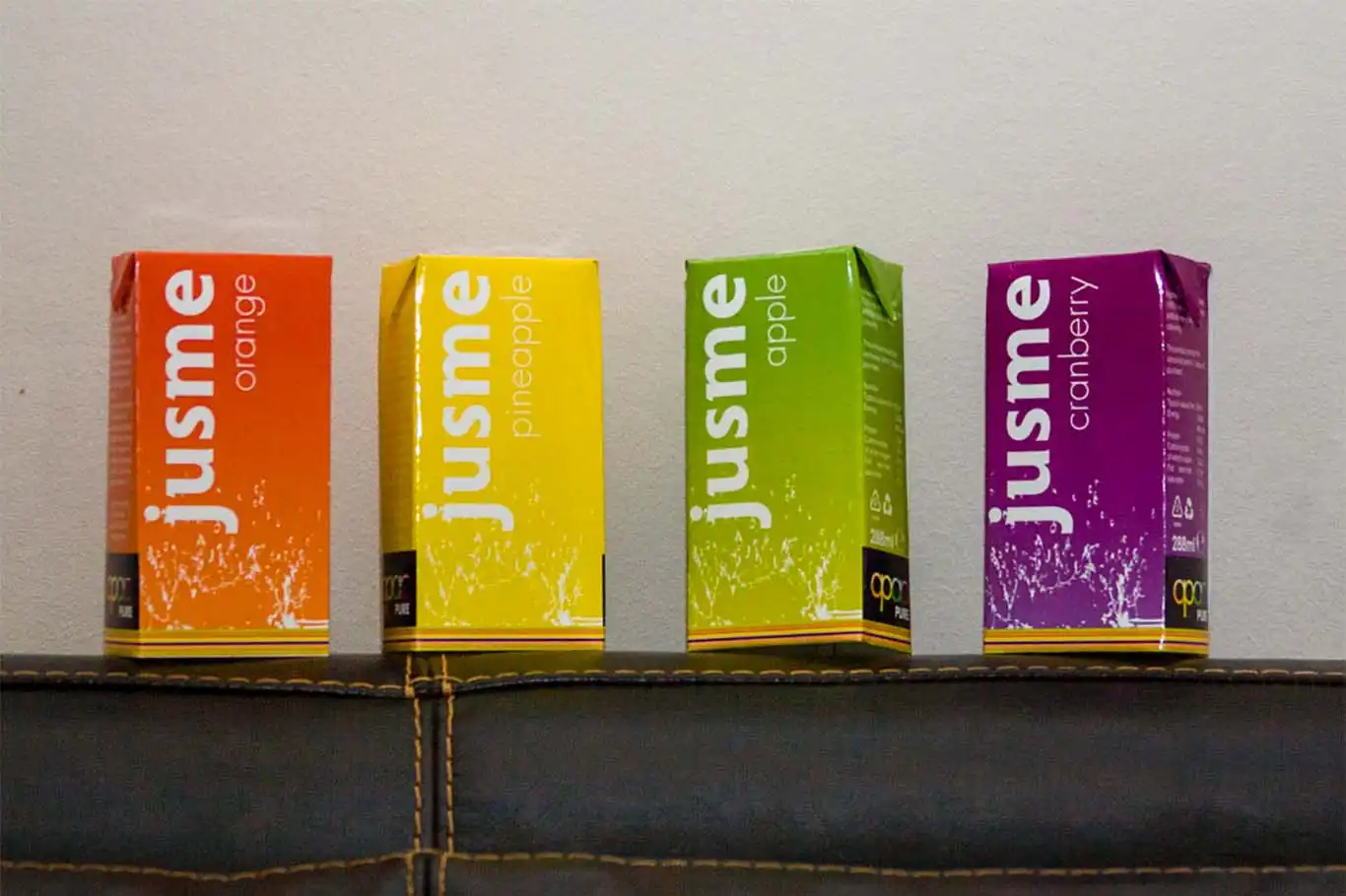
On the shelf sits a vibrant array of juice boxes, each boasting an eye-catching packaging design. The flavors are presented in sequence: orange, pineapple, apple, and cranberry. The brand “jusme” is playfully inscribed in lowercase on each box, with hues matching the flavors: a zesty orange, a bright yellow, a fresh green, and a deep purple.
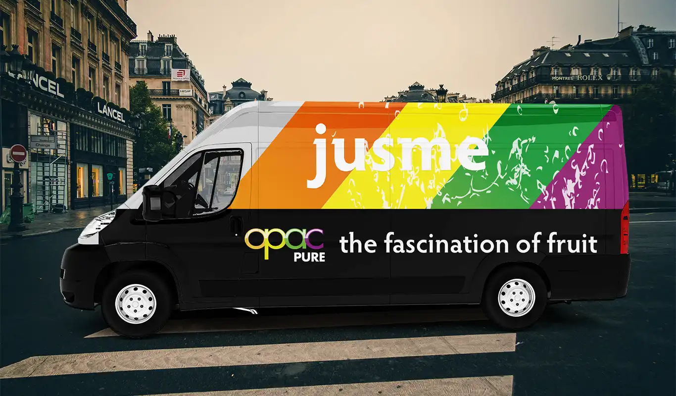
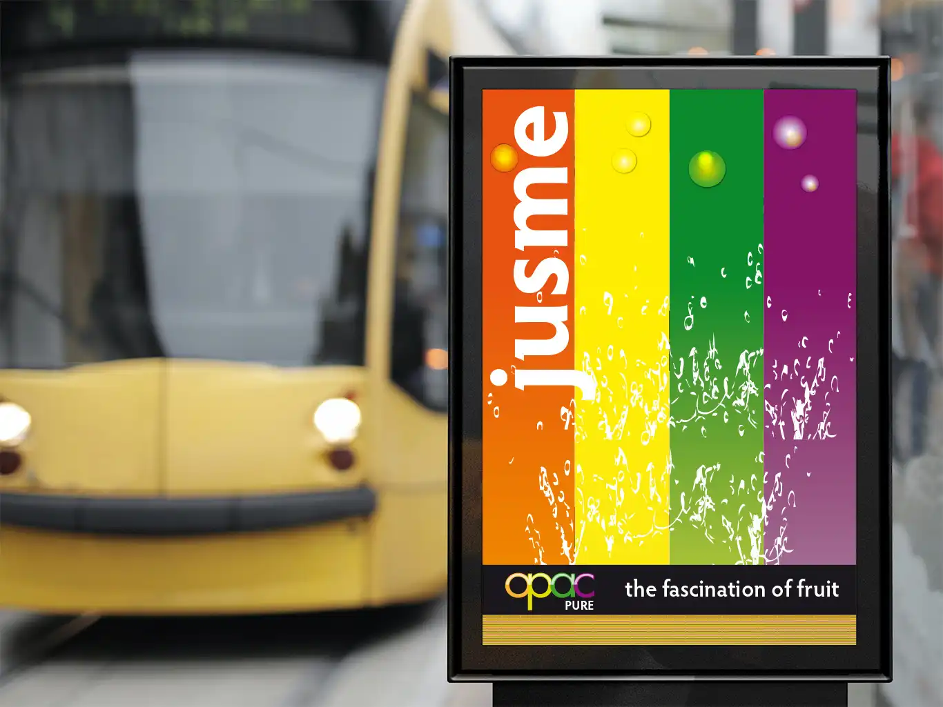
Parked on a city street, a black van with a white cab stands out with its vibrant side design. “Jusme” is emblazoned across a rainbow backdrop, while “OPAC PURE the fascination of fruit” adorns the lower section against a stark black.
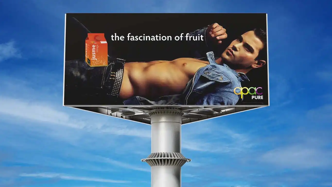
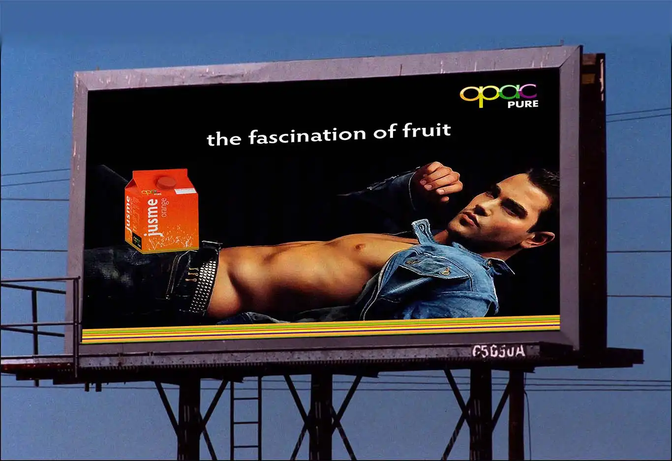
The billboard showcases an advertisement with a shirtless man reclining, donned in low-rise jeans and an open denim jacket. Accompanying him is the phrase “the fascination of fruit,” alongside an orange juice carton that highlights its elegant packaging. The OPAC PURE logo is also prominently displayed, set against the backdrop of a clear blue sky.
Additional Information
Project: Jusme – OPAC Packaging Design
Jusme Juice, Fruit Juice is the brief I took for my project for my City and Guild project; I took time to look around at other fruit juice companies and researched the designs and ideas. I then started looking for a name that would grab attention and deliver the brief; here are some of the names I came up with.
OPAC
Opac is what I went for. It did not mean anything evident at first glance but came from the ingredients. (Orange – Pear- Apple – Cranberry) Jusme was the product itself. It had to be a gimmick; with hundreds of drinks out there, it had it be fun and appealing. So looking for names, I looked at other languages juice in French jus. This was the one I went for, and I also wanted to add more to it as an idea; it’s all about me and being fresh and thirst-quenching.
I returned to the brief to look at how I would design this. I used word games to come up with ideas. I designed the logo for the company and chose the typeface for it; future standards gave the soft roundness that I required for the shape of the fruit as most are of that shape, and if fruits attract us naturally, by shape and colour, why not take that from it? As I re-looked at the ideas and project brief, I realised that I could continue using the fruit Idea and the ME for other products under the opac name.
Jusme Juice Packaging Design
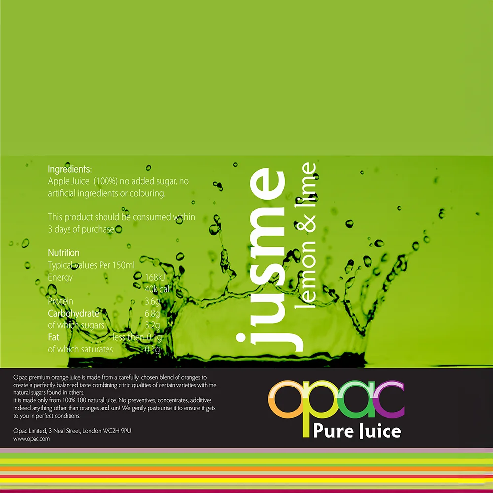
Jusme typeface is clean and sharp but still smooth and appealing. These are other attempts to develop a design for the jusme brand name. The first idea of the product packaging layout is the bands of colour, the fresh splash and the jusme. “This did not work.
The image was wrong and limited to its use; the strips were not working with the whole idea” Much the same, but this time the splash was a vector and was able to adjust to the restrictions. The background was more accessible and more manageable, and the opac stands proud, but there was something not working, and after time, I came to realise it was that both names were fighting for its space.
A rethink was needed to see whole all the elements could be kept and if each had its place and importance. Hence the product is born. Check out a post with early development Opac.
Resources Used Credit
Photo by Margerretta from Pexels

